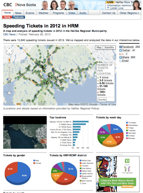
My story Tuesday night had a multi-platform angle. We requested a list of all the speeding tickets police doled out in the HRM. The spread sheet we received contained a lot of data. After some organization, it showed what locations people get the most tickets
.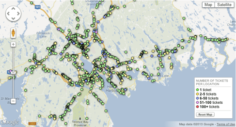
We also could see which days of the week and months people speed the most and which gender speeds more; men or women. Overall, a boring spreadsheet turned into a great story. Special thanks to CBC web developer Dean Gallant who organized the data and designed the interactive.
")